It’s an exciting time to be a RecOps professional. We are experiencing a fundamental shift in how companies approach the hiring process, and more emphasis than ever is being placed on making data-driven decisions that positively impact the hiring process.
The flip side of that coin is that it can be hard to keep track of all of the data involved in talent acquisition. Building a well-thought-out hiring dashboard allows you to centralize your data, optimize your process, and make better, more informed hiring decisions.
In this fifth installment of our Ultimate Recruiting Operations Dashboard series, we discuss the “recruiting team productivity” dashboard. We’ll show you how to tailor your hiring dashboard to look specifically at your recruiting team’s productivity. We’ll talk through the recruiting metrics you should be tracking and why, and we’ll give you some templates you can use to build the perfect hiring dashboard for your needs.
If you’d like to read the other articles in our Ultimate Guide to Hiring Dashboards series check out the links below:
The recruiting team productivity dashboard
As a Recruitment Operations professional, your recruiting staff is the most significant investment you will make, and they are the deciding factor in whether or not you meet your hiring targets. However, many internal and external factors play a role in whether or not your team is succeeding in its ultimate goal of finding and securing top talent for your organization.
Your recruiting team productivity dashboard takes a deep tactical look at how each member of your TA team is performing against their individual hiring goals. This allows you to easily see which recruiters are succeeding and which ones may need some help. This dashboard also enables you to optimize and manage your team’s performance and output as you continue to scale your recruitment efforts.
Key metrics to include in your recruiting team productivity dashboard:
All metrics in the essential hiring dashboard
Total hires month-over-month
Total hires by recruiter
Offer acceptance rate month-over-month
Offer acceptance rate by recruiter
Time to hire by recruiter
Job time open by recruiter
Number of candidates in each stage
Candidate time in stage
Passthrough rates by stage
Outreach stats by recruiter
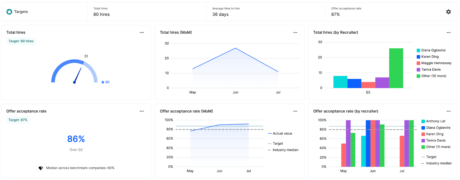
Here’s what your pipeline composition dashboard may look like in Gem:


Total hires month-over-month
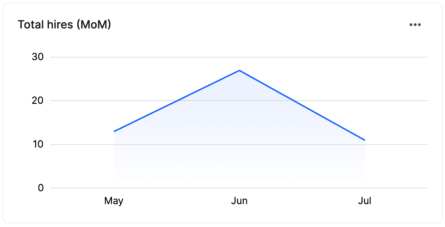
Looking at your hires by month allows you to see how hiring is trending at your organization and show how your company is growing over time. This metric is also incredibly valuable for showing leadership how the efforts of your TA team are paying off. Keep in mind that many factors can influence your hires from one month to the next including strategic & growth goals, type and seniority of roles you’re hiring for, and even seasonality and geographic location, etc., so it’s important to look for overall trends in your data.
For example, you may see a drop in hires from one month to another due to a hiring push for more mid/senior level roles, which is somewhat expected and not necessarily a cause for alarm. However, if hiring is down four months in a row and you’re missing your hiring targets, this could be an indication that there is a roadblock in your hiring funnel, and you’ll have to dig deeper into your process to find out where it is.
Total hires by recruiter
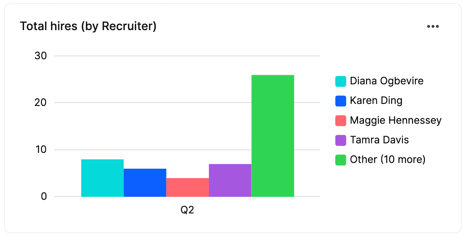
At the end of the day, your recruiters are responsible for getting folks hired at your company. Adding total hires by recruiter to your team productivity dashboard makes it easy to visualize the performance of your recruiting team.
However, just like hires by month, when looking at this metric, it’s essential to make sure you’re making an apples-to-apples comparison of the roles each recruiter is tasked with hiring (i.e., same department, experience level, etc.). For example, a recruiter hiring for an entry-level sales role will likely have a much easier time filling their reqs than a recruiter hiring for a senior product designer. Or, if all recruiters are responsible for hiring across similar levels, departments, etc., you can use this metric to see which recruiters are doing well and which ones may need some help—there may be some messaging specific recruiters are using that is increasing offer accepts and should be adopted across the team.
Offer acceptance rate month-over-month
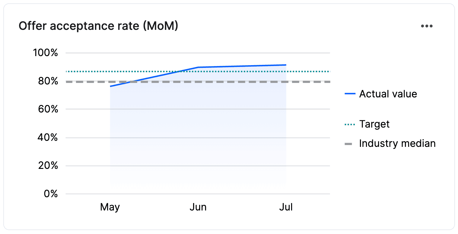
Adding the total number of hires to your dashboard is a great start, but looking beyond the total number will give you more significant insights and allow you to plan for the more nuanced aspects of the final stage of the process that may impact your ability to hit your hiring goals.
Including offer acceptance rate (OAR) over time in your team productivity dashboard will give you insight into how competitive your offers are now compared to last quarter, last year, etc. Increases in OAR are a great way to show how your team is improving at selling candidates on your company mission and/or on the benefits you offer.
On the other hand, a decline in OAR may require you to dig into your offer rejection reasons to figure out why. You may find the need for new messaging to highlight what your company can offer candidates or the need to reevaluate your offers to make them more competitive with the current job market. Or alternatively, a decline in OAR may simply mean that your recruiters need to be more explicit about things like compensation packages earlier in the interview process so there are no surprises when extending an offer.
Median time to hire by recruiter
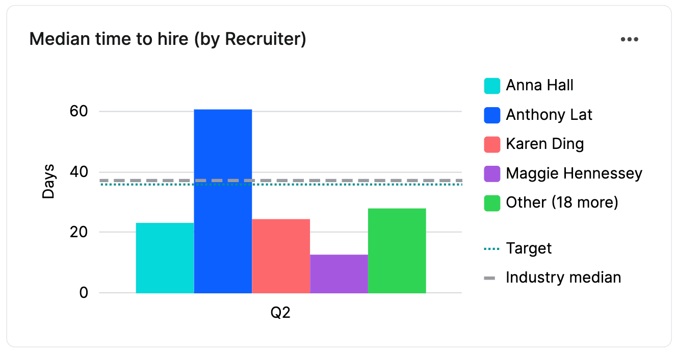
We all want great candidates to move through the hiring process as quickly as possible. Adding median time to hire by recruiter can be a good indicator of your recruiter’s efficiency and speed. However, this metric needs to be looked at based on the type and seniority each recruiter is responsible for hiring. The time to hire an entry-level evergreen role will be faster than the time to hire for a senior-level one-off or hard-to-fill role.
Job time open by recruiter
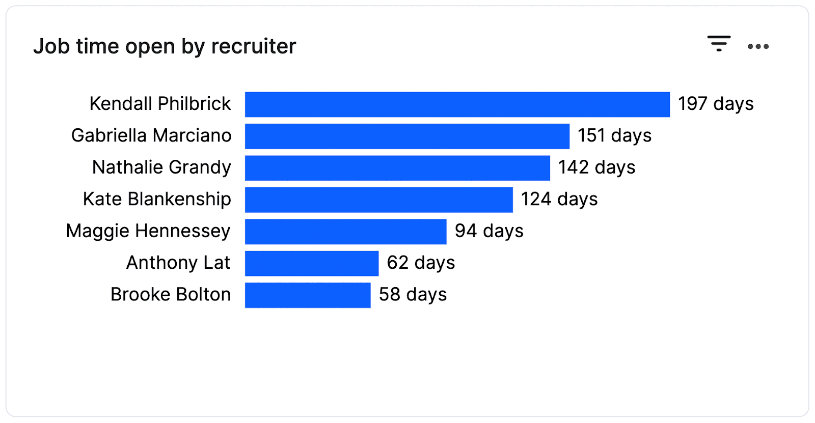
A common occurrence across larger recruiting teams is that silos tend to form and information is not as easily shared. Looking at these numbers can give you insights into opportunities for improvement across your team and who on your team may be great to partner with for training or a best practice share.
Number of candidates in each stage
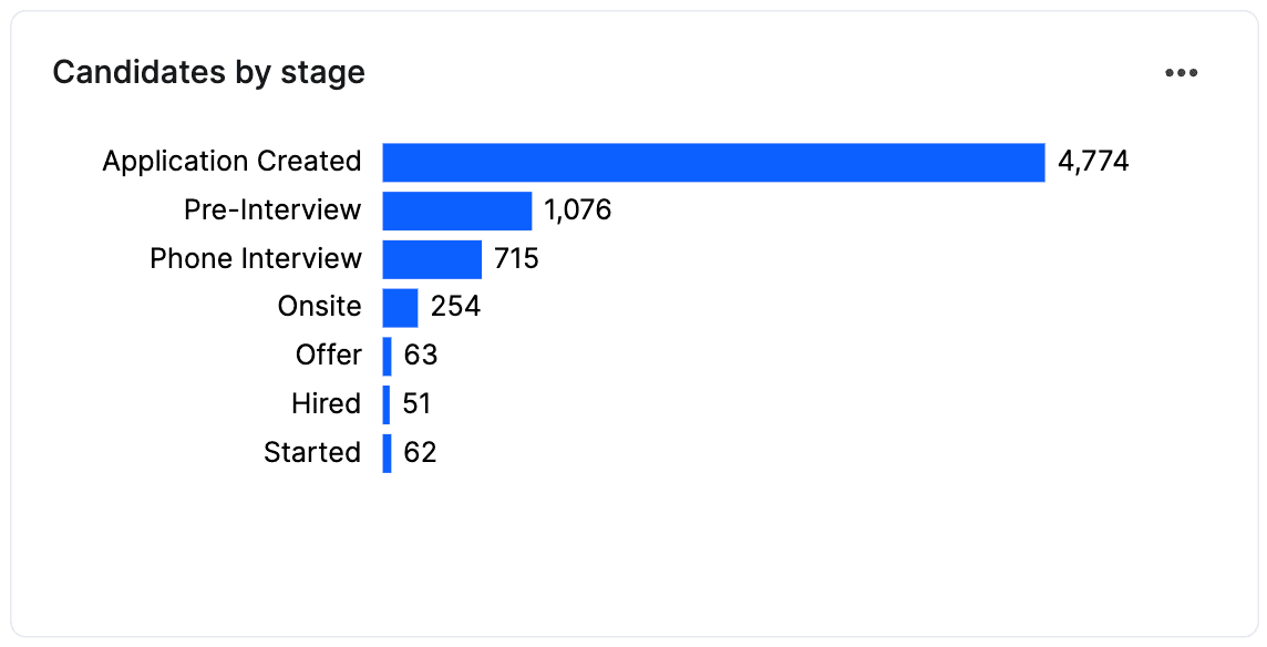
Your current hiring pipeline is essentially a snapshot of how many candidates are at each stage of your hiring process. While your pipeline is likely constantly changing and (hopefully) improving, it’s still important to include it in your hiring dashboard as it will allow you to present your TA team’s efforts to internal stakeholders and your team to answer tactical questions like: How many candidates are currently in process? Where are the sticking points in the hiring process? How many offers have your team extended? Where in the funnel are your (and your hiring managers’) efforts most needed? And so on.
Median candidate time in stage
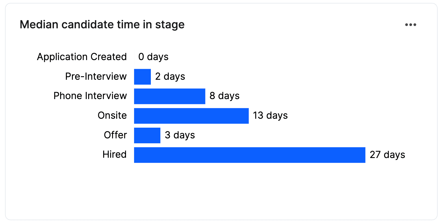
Now more than ever, this is an incredibly important metric. In a tight labor market, candidates are much more likely to drop out of your hiring process if things are moving too slowly. Adding time in stage to your dashboard will allow you to visualize exactly how much time candidates are spending at each stage and where bottlenecks may be in your process. This will inevitably lead to lower drop-off rates and better overall candidate experience.
Passthrough rate by stage

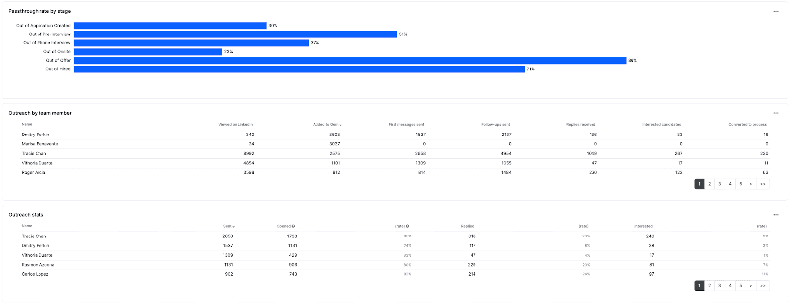
Similar to time in stage, including passthrough rate by stage in your hiring dashboard will allow you to spot potential roadblocks within your hiring process that may be impacting your ability to hit your goals. For example, suppose you see a significant drop in passthrough rates from pre-interview to a phone interview. This may signal a misalignment between the recruiter and hiring manager in the education, skills, etc., needed for the role; and a simple re-calibration may be the fix.
Outreach stats by recruiter

Including outreach stats in your team productivity dashboard will allow you to visualize your team’s sourcing efforts and how they drive impact toward organizational goals. Recruiters may be using different tactics, messaging, mediums of contact, etc. and this will allow you to see which ones are paying off. Looking at your outreach stats, you can identify which recruiters are achieving the best hiring outcomes and which ones may need to tweak their strategies to improve their stats (however, again, when comparing individual recruiter metrics like these, it’s important to make sure you’re making fair comparisons). You can also use this data to make the business case for how each team member’s outbound efforts are directly contributing to company growth to ensure your team gets proper resource allocation and investment.
As a RecOps professional, you know the value of good data—it informs nearly every facet of your job and empowers you to make better decisions for your TA team. Creating easy-to-read hiring dashboards is the key to better understanding your recruiting data and getting buy-in from key stakeholders that are critical to your role. Your recruiting productivity dashboard allows you to review your recruiting team’s performance, have more data-driven conversations with your team, optimize your hiring process, and remove any potential roadblocks keeping you from meeting your hiring goals.
If you’d like to learn more about how to build your own recruiting team productivity dashboard, get in touch with us today!
Share
Related posts

November 7, 2025
Flat teams, growing demands: What our 2025 recruiting survey reveals

October 24, 2025
How to build an effective recruiting capacity plan

August 26, 2025
Why Gem's Workday ATS integration is different and better
Your resource for all-things recruiting
Looking for the latest data, insights, and best practices? Welcome to the Gem blog. We've got you covered.
